UI/UX for VR
Designing for VR requires different considerations than mobile. This guide covers the key differences and how to adapt your React Native UI for Meta Quest.
Key Differences
- Resizable windows: Apps can be moved and resized by users
- Controller input: Touch is replaced by pointer/hover interactions
- Spatial context: Content floats in 3D space
- Comfort: Readability and ergonomics are critical
- No system UI: No back button, different navigation patterns
Windowing & Layout
On Meta Quest, apps run in resizable windows that users can move and resize. Your layout must adapt to these changes.
Window Behavior
- Default size: ~1000 × 625 pixels
- Resizable: Users can resize windows dynamically
- Movable: Windows can be repositioned in 3D space
- Responsive: Layout must adapt to size changes
Responsive Design
Use Flexbox as your base layout system:
Tracking Window Size
Use useWindowDimensions to track size changes:
If using React Navigation, useFrameSize provides window size:
Breakpoints
Implement breakpoints for different window sizes:
For complex responsive layouts, consider Unistyles V3 which supports media queries and breakpoints.
Styling
Styling in VR affects comfort and readability. Follow these guidelines for typography, icons, colors, and spacing.
Typography
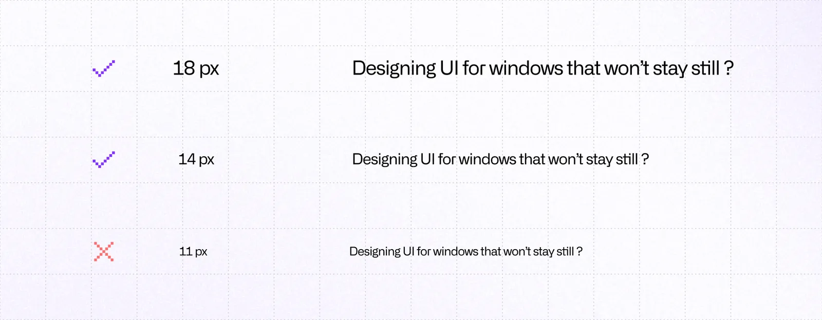
Font sizes:
- Minimum: 14px for legibility
- Recommended: 18px+ for comfortable reading
- Body text: 18-20px
- Headings: Scale appropriately (24px+)
Font selection:
- Use sans-serif fonts with high x-height
- Inter (used in Meta Horizon OS UI) is a good default
- Avoid very thin weights
- Use Regular, Medium, and Bold weights
Icons
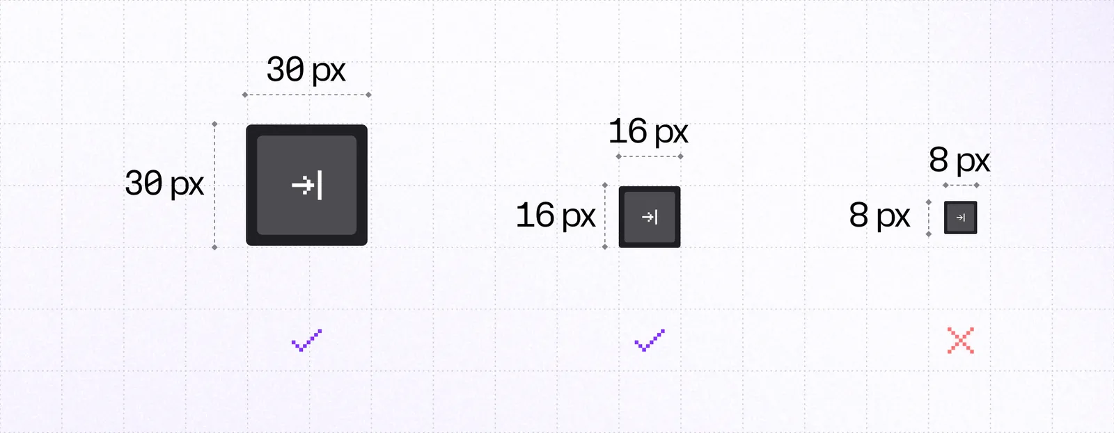
Sizes:
- Default action icons: 24dp
- Compact indicators: 12-16dp
- Status icons: 16dp
Best practices:
- Use filled variants for better visibility
- Keep icons visually simple
- Avoid very thin strokes
- Ensure tap targets are larger than icons (48dp minimum)
Colors & Contrast
Use WCAG 2.1 ratios as baseline:
- AA minimum: 4.5:1 for normal text
- AA large: 3:1 for large text
- AAA: Higher contrast for better accessibility
Your app window can appear over dark rooms, bright passthrough, or 3D environments. Ensure sufficient contrast in all scenarios.
Spacing

- Minimum: 8-12dp between interactive elements
- Groups: Extra padding between groups
- Window edges: Leave margin around edges
Use spacing to create visual hierarchy:
Interactivity
VR interactions rely on hover states, clear feedback, and appropriate hit targets.
Hover States
Hover states are essential in VR. Users point at elements before clicking.
Provide clear visual feedback:
- Scale: Slight scale increase on hover
- Color: Background or border color change
- Glow: Subtle glow effect
- Opacity: Opacity change
Hit Targets

- Minimum: 48dp × 48dp
- Recommended: Larger for important actions
- Spacing: Adequate space between targets
If an element is visually smaller, add invisible hit slop:
Animations
Use animations to provide feedback and guide users. Recommended libraries:
- react-native-reanimated: High-performance animations
- react-native-gesture-handler: Gesture handling
Consider using libraries that handle VR interactions: pressto for VR-focused interactions or react-native-aria for accessibility-focused components.
Accessibility & Comfort
These guidelines help create apps that are comfortable for extended use.
Controller Support
- Minimize button presses: Simplify interactions
- Clear navigation paths: Logical control schemes
- Support control remapping: Allow users to customize
- Save preferences: Remember user settings
Feedback
Visual feedback:
- Clear hover states
- Obvious press feedback
- Focus indicators
Audio feedback:
- Sound effects for actions
- Spatial audio when appropriate
Haptic feedback:
- Controller vibration for interactions
- Tactile response to actions
Head Movement
- Avoid excessive head movement: Keep important content centered
- Comfortable viewing angles: Don't require extreme head positions
- Stable UI: Avoid head-locked UI elements
Session Length
VR sessions are typically shorter than mobile:
- Shorten time to fun: Get users to core functionality quickly
- Clear value: Show benefits immediately
- Progressive disclosure: Don't overwhelm with information
Testing Checklist
- Text is readable (18px+)
- Contrast meets WCAG AA (4.5:1)
- Hit targets are 48dp minimum
- Spacing is generous (8-12dp)
- Focus states are clear
- Controls are simple
- Head movement is minimized
Use Meta Quest accessibility settings and React Native DevTools for testing.
Navigation
Meta Quest doesn't have a universal system back button. Your app must provide in-app navigation controls.
In-App Back Controls
Unlike mobile platforms, you must:
- Include in-app back controls
- Provide clear navigation paths
- Support both controllers and hand tracking
Keep back controls in a consistent location:
- Top-left: Common pattern
- Header: Always visible
- Clear label: "Back" or arrow icon
Dismiss Patterns
For modals and overlays:
Platform Detection
Use platform detection for VR-specific navigation: